Some ideas on enhancing User Experience on Qlik Sense
Introduction
After the successful delivery of a data analytics product, a common challenge faced is to enhance user adoption. One of the definitions of user adoption from an Indeed article is as follows:
User adoption rates are important because they tell a company or business how many users like the new product or version and how many don’t like it or do not try it. Most often, a higher adoption rate means a customer finds both value and ease in using the new product or version. Conversely, if a customer finds it requires too much effort to use or doesn’t add value, they may abandon the product altogether or stay with an older version.
https://www.indeed.com/career-advice/career-development/user-adoption
One of the necessary ingredients to a successful adoption is the user experience on the interface. In this article, I would like to cover on ways we have found useful to make dashboards on Qlik Sense Apps more intuitive and user friendly.
The three areas I would like to cover are as follows:
- Menu Page for holistic view of overall health of business
- Navigation Bars for navigating between apps and within each app
- Online Help and Information
The Qlik Sense demo app can be found in the following Github link:
https://github.com/ZS-Weng/QlikSense/blob/main/QlikSense%20Navigation.qvf
Menu Page for holistic view of overall health of business
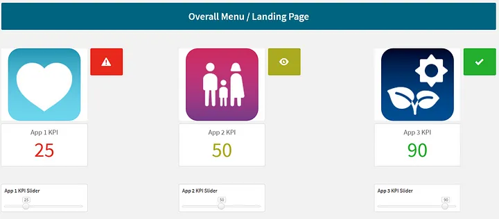
In a data analytics / business intelligence product, it usually can consist of several apps or reports based on different aspects of the business. Inspired by Fitbit’s health analysis charts, the menu page for a Qlik Sense dashboard is customized with icons and the most important KPI. Based on the thresholds set, users can have an holistic understanding on the overall health summary from various aspects of the business.
The picture below illustrates how the color of the KPI and icon will change based on the changing value. The threshold set is 33 and 66.
![]()
Qlik Sense Codes: The thresholding can easily be setup in Qlik Sense with if statements.
- Code for controlling the colors on the KPI and Icons in Qlik Sense:
=if(v_KPI3 <= 33, ‘#e8291c’,
if( v_KPI3 > 33 and v_KPI3 <= 66 , ‘#abaa20’,
if( v_KPI3 > 66, ‘#25af2f’)))- Code for controlling the Icon Image in Qlik Sense:
=if(v_KPI3 <= 33, ‘Warning triangle’,
if( v_KPI3 > 33 and v_KPI3 <= 66 , ‘View’,
if( v_KPI3 > 66, ‘Tick’)))
Other resources for creating the icons
- Free icons can be downloaded from: https://icons8.com/
- The websites that provides reference on beautiful gradient color combinations: https://uigradients.com/ , https://digitalsynopsis.com/design/beautiful-color-ui-gradients-backgrounds/
- Online tools that can invert a black and white icon: https://www.google.com/search?q=image+invert
- Python Code that can invert a black and white icon:
import os
from PIL import Image, ImageOps
from matplotlib.pyplot import imshow
from pathlib import Path

"""
Setup Base and Process Folder
"""
# Enter base folder path
base_folder = Path("./icons")
image_paths = Path.glob(base_folder, "*.png")
processed_folder = "./icons/processed/"
os.makedirs(processed_folder, exist_ok=True)


def image_invert(image_path):
    """
    Perform image inversion of the colots and set transparent map
    for black pixels
    """
    image = Image.open(image_path)
    if image.mode == "RGBA":
        r, g, b, a = image.split()
        rgb_image = Image.merge("RGB", (r, g, b))
        inverted_image = ImageOps.invert(rgb_image)
        r2, g2, b2 = inverted_image.split()
        final_transparent_image = Image.merge("RGBA", (r2, g2, b2, a))
        return final_transparent_image

    else:
        inverted_image = ImageOps.invert(image)
        return inverted_image


for image_path in image_paths:
    inverted_image = image_invert(image_path)
    newpath = Path.joinpath(base_folder, "processed", image_path.stem + "_inverted.png")
    inverted_image.save(newpath)
Navigation Bars between apps and within each app
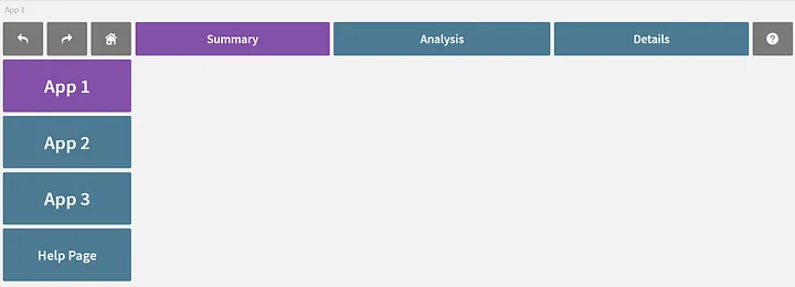
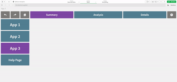
To make the navigation across apps and within an app more intuitive, buttons can be used to create the respective navigations. In our projects, we aim to create an experience similar to navigating websites with the side bars providing navigation between apps and top bars within each app. The top bars for our case are standardized to enable users to drill down from Summary > Analysis > Details.
Sample Code in Qlik Sense on Variable Setup:
Set v_TopBarSelectedColor = ‘#8351a8’;
Set v_TopBarUnSelectedColor = ‘#4d7b93’;
Set v_SideBarSelectedColor = ‘#8351a8’;
Set v_SideBarUnSelectedColor = ‘#4d7b93’;
Set v_SideBar1Text = ‘App 1’;
Set v_SideBar2Text = ‘App 2’;
Set v_SideBar3Text = ‘App 3’;
Set v_SideBar4Text = ‘Help Page’;
Set v_SideBar1Link = ‘a0d70b49–7a21–44d0-b9a9-daaa0701c175’;
Set v_SideBar2Link = ‘e03b4a67–89c1–425b-852c-44d112e48d7c’;
Set v_SideBar3Link = ‘adc68de9–5a42–40ef-bdcf-dffa2981d83c’;
Set v_SideBar4Link = ‘f3e454e2-ea27–46ef-bc5a-d1ddd280aaf9’;
Set v_helppageLink = ‘f3e454e2-ea27–46ef-bc5a-d1ddd280aaf9’;
Set v_menupagelink = ‘be0a8400–5df7–4783–8339–1e44e66b04e5’;
Online Help and Information
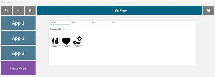
In many projects, often training materials are shared in PowerPoint decks or word documents. These documents might not be easily accessible to every user and it may become challenging at times for users to find the right reference guide when they need help while navigating an analytics app. In our projects, we recommend for the help pages to be built in within as an accompanying sheet or app so that it will be online together with the analytics product.
Conclusion
In this article, I have aimed to share how user experience can be enhanced on Qlik Sense applications with out of the box capabilities.
Any further enhancements will likely require tools beyond the application builder like Mashups or D3.js custom visualizations.
Thanks for reading and hope the information was useful in some way!